  |
GoFiler Legato Script Reference
Legato v 1.6f Application v 6.4a
|
| Table of Contents | < < Previous | Next >> |
Chapter Nine — Dialog Functions (continued)
Regardless of whether a dialog is modal or modeless, it must be loaded from a dialog resource template. Dialog resource templates are stored either in the same file as the main script or stored in a separate file that ends with a .rc file extension. The resource template specifies the size and contents of a dialog, as well its appearance and some of its behaviors. The resource template indicates which controls belong to the dialog and where they are positioned. Multiple dialogs can use a single resource template.
Templates embedded in a script file can be more convenient programmability but the resource cannot be easily accessed by third-party editors, such as Visual Studio. It should also be noted that creating or editing resource files in third-party editors can disrupt or add headers that may not exist or be available to Legato. Programmers should exercise caution.
The IDE contains a couple of helper scripts: Edit Dialog Control to edit statements and Test Dialog to quick visually examine an aggregate dialog box.
Note that resource data is compiled during the parse phase of script execution and then stored.
The following is an example of a simple dialog and its underlying resource template:
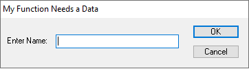
NameQuery DIALOG 0, 0, 240, 44
STYLE DS_MODALFRAME | DS_3DLOOK | WS_POPUP | WS_VISIBLE | WS_CAPTION
CAPTION "My Function Needs a Data"
FONT 8, "MS Sans Serif"
{
 CONTROL "Enter Name:", -1, "static", SS_LEFT | WS_CHILD | WS_VISIBLE, 6, 16, 44, 8, 0
 CONTROL "", 101, "edit", ES_LEFT | WS_CHILD | WS_VISIBLE | WS_BORDER |
                                               WS_TABSTOP, 53, 15, 119, 12, 0
 CONTROL "OK", IDOK, "BUTTON", BS_DEFPUSHBUTTON | BS_CENTER | WS_CHILD | WS_VISIBLE |
                                               WS_TABSTOP, 186, 6, 45, 12
 CONTROL "Cancel", IDCANCEL, "BUTTON", BS_PUSHBUTTON | BS_CENTER | WS_CHILD |
                                               WS_VISIBLE | WS_TABSTOP, 186, 24, 45, 12
 }
(In the example, line returns have been added to the control statements for
display purposes. They cannot
be in the source file. Each control must be on its own line.)
Note that the dialog is named in the “header”. A dialog resource is differentiated from other resources by the “DIALOG” or “DIALOGEX” designation. Certain style data is defined followed by a “body” of controls where each control is created in the order in which they are defined (also the tabbing order).
In the above example, there are four controls: a “static” text control for the legend, an “edit” control for the text to be input, and two buttons. The CONTROL term is used in which the initial text or title of the control is provided, followed by a Control ID, a series of styles, and the position and size of the control.
9.4.3 Dialog Resource Structure
Header:
In both the standard and extended templates for dialog boxes, the header includes the following general information:
• The location and dimensions of the dialog box.
• The window and dialog box styles for the dialog box.
• An optional menu resource for the dialog box. The template can indicate that the dialog box does not have a menu, or it can specify an ordinal value or string that identifies a menu resource.
• The window class of the dialog box. For CONTROL style, this must be specified as a string naming the windows class. For other entries, such as PUSHBUTTON or COMBOBOX, the declaration implies the control type or class.
• A string that specifies the title for the dialog box window. If the string is empty, the title bar of the dialog box is blank. If the dialog box does not have the WS_CAPTION style, the system sets the title to the specified string but does not display it.
• If the dialog box has the DS_SETFONT style, the header specifies the point size and typeface name of the font to use for the text in the client area and controls of the dialog box.
In an extended template, the header also specifies the following additional information:
• The help context identifier of the dialog box window when the system sends a help message.
• If the dialog box has the DS_SETFONT or DS_SHELLFONT style, the header specifies the font weight and indicates whether the font is italic.
Controls:
Following the template header is a body containing one or more control definitions that describe the controls of the dialog box. The control definition includes the following information:
• The location and dimensions of the control. This is expressed in dialog units from the top left of the client area of the dialog page. It does not include the caption, tab or any frame areas.
• The window and control styles for the control. There are three types of styles: window styles, class styles and extended styles. Window styles include information such as bits to indicate if a control is disabled, starts a group or if it is a tab stop. Class styles are specific to the control class. For example, for a combobox, one class style indicates whether the control is a list, a dropdown, or an editable dropdown. These bit positions are shared across classes but their meaning will be different. Finally, extended styles apply to the window and the class.
• The control identifier. The identifier or ID is used to access the control within a dialog page. This is a 16-bit value (signed or unsigned) where -1 has the meaning of no specific control ID. The value -1 is frequently used for controls, such as legends, that do not need to be addressed.
• The window class of the control. This can be either the ordinal value of a predefined system class. a string that specifies the name of a registered window class or an alias name that directs to a registered window class.
• A string that specifies the initial text of the control, or an ordinal value that identifies a resource, such as an icon, in an executable file. Depending on the class, the value may be ignored or set the initial state of a control. For example, a legend normally has the text value set.
9.4.4 Dialog Units and Measurements
Every dialog box template contains measurements that specify the position, width, and height of the dialog box and the controls it contains. These measurements are device independent such that a script can use a single template to create the same dialog box for all types of display devices. This ensures that a dialog box will have the same proportions and appearance on all screens despite differing resolutions and aspect ratios between screens. The measurements in a dialog box template are specified in dialog template units. Dialog units are not necessarily scaled the same vertically and horizontally.
By default, Legato will center dialogs on the application which the dialog appears. The position can be altered with the DialogPositionRight and DialogPositionLeft functions and returned to center with the DialogPositionCenter function.
The template may specify the initial coordinates of the upper left corner of the dialog box. Usually, the coordinates are relative to the upper left corner of the owner window’s client area. When the template specifies the DS_ABSALIGN style, the position is relative to the upper left corner of the screen. The system sets this initial position when creating the dialog box. The dialog template should specify a dialog box width and height that does not exceed the width and height of the screen and ensures that all controls are within the page of the dialog box. Although the system permits a dialog box to be any size, creating one that is too small or too large can prevent the user from providing input. Many applications use more than one dialog box when there is a large number of controls. In such cases, the initial dialog box usually contains one or more buttons that the user can choose to display the next dialog box.
The operating system automatically gives a dialog box a window menu when the template specifies the WS_SYSMENU style. To prevent inappropriate input, the system automatically disables all items in the menu except “Move” and “Close”. The user can click “Move” to move the dialog box. When the user clicks “Close”, the script engine calls the close procedure attached to the dialog. This is identical to clicking the “Cancel” button.
Although other menus in dialog boxes are not recommended, a dialog box template can specify a menu by supplying the identifier or the name of a menu resource. In this case, the script engine loads the resource and creates the menu for the dialog box. Applications typically use menu identifiers or names in templates when using the templates to create custom windows rather than dialog boxes.
A modal dialog box should be a pop-up window having a window menu, a title bar, and a thick border (in Windows 10 the style has been changed to a visually thin frame); that is, the dialog box template should specify the WS_POPUP, WS_SYSMENU, WS_CAPTION, and DS_MODALFRAME styles. Although an application can designate the WS_VISIBLE style, the system always displays a modal dialog box whether or not the dialog box template specifies the WS_VISIBLE style. An application must not create a modal dialog box having the WS_CHILD style. A modal dialog box with this style disables itself, preventing any subsequent input from reaching the application.
As in Windows, the script engine uses the average character width of the dialog box font to calculate the position and dimensions of the dialog box. By default, all text in a dialog box will be drawn using the SYSTEM_FONT font. To specify a font for a dialog box other than the default, use the FONT Statement. In a dialog box template, set the DS_SETFONT or DS_SHELLFONT style and specify a point size and a typeface name. Even if a dialog box template specifies a font in this manner, the script engine always uses the system font for the dialog box title and dialog box menus.
The system font can vary between different versions of Windows. To force the application to use the system font no matter which system it is running on, use DS_SHELLFONT with the typeface “MS Shell Dlg” and use the DIALOGEX Resource instead of the DIALOG Resource. Windows maps this typeface such that the dialog box will use the “Tahoma” font. Note that DS_SHELLFONT has no effect if the typeface is not “MS Shell Dlg”.
The dialog template specifies the position, width, height, style, identifier, and window class for each control in the dialog box. The window class indicates what type (i.e., a text field or a checkbox) the control is. The window class can be either a predefined class or a custom class. Controls are created in the order they are specified in the template. The template should specify the appropriate number, type, and order of controls to ensure that the user can enter the input needed to complete the task associated with the dialog box. No dialog can have more than 255 controls associated with it.
For each control, the template specifies style values that define the appearance and operation of the control. Every control is a child window and therefore must have the WS_CHILD style. To ensure that the control is visible when the dialog box is displayed, each control must also have the WS_VISIBLE style. Other commonly used window styles are WS_BORDER for controls that have optional borders, WS_DISABLED for controls that should be disabled when the dialog box is initially created, and WS_TABSTOP and WS_GROUP for controls that can be accessed using the keyboard. The WS_TABSTOP and WS_GROUP styles are used in conjunction with the dialog keyboard interface. The template may also specify control styles specific to the control’s window class. For example, a template that specifies a button control must give a button control style such as BS_PUSHBUTTON or BS_CHECKBOX. For a complete list of window classes and their styles, see Section 9.6 Dialog Controls and Common Controls.
When the script engine creates a control, it specifies the dialog box as the parent window. This means the position coordinates of the control will be relative to the upper left corner of the dialog box’s page.
A dialog control is said to have focus when the user’s next input (via mouse or keyboard) will affect that control. There are multiple ways focus can be moved through the controls on a dialog. Programmers can specify quick keys for a control by using the “&” in the control’s caption. For example, “&Link Type” produces a caption of “Link Type”. This allows the user to press ALT + L to have this control gain focus. In addition, the programmer can permit the user to tab through controls on a dialog by using the WS_TABSTOP flag in conjunction with the control order as specified on the template. The ControlSetFocus function also permits shifting focus to a particular control.
Controls can also be hidden, made visible, disabled, and enabled by the ControlHide, ControlShow, ControlDisable, and ControlEnable functions, respectively.
Control IDs are integers used to identify each control. Control IDs are used to reference the control on the dialog, such as when gathering user input from the control or altering the control’s state. Static controls are the only controls that do not require unique identifiers because they send no messages. In this case the control ID can be -1 or 0xFFFF.
Programmers may define their own control IDs and they can range from 100 to 65534. Programmers are cautioned against using values lower than 100 since many belong to defined IDs. The table below outlines these IDs:
| IDOK | 1 |
| IDCANCEL | 2 |
| IDABORT | 3 |
| IDRETRY | 4 |
| IDIGNORE | 5 |
| IDYES | 6 |
| IDNO | 7 |
| IDCLOSE | 8 |
| IDHELP | 9 |
| IDTRYAGAIN | 10 |
| IDCONTINUE | 11 |
When given one of these IDs, a control may inherit unwanted properties or be routed to the inappropriate event procedure. For example, IDOK will always cause a dialog to go through the validate and exit procedure.
To permit the user to close the dialog box, the template should specify at least one push button and give it the control identifier IDCANCEL. To permit the user to choose between completing or canceling the task associated with the dialog box, the template should specify two push buttons labeled “OK” and “Cancel” with control identifiers of IDOK and IDCANCEL, respectively. Assigning a custom control ID to an “OK” or “Cancel” button will result in the event being handed to the action procedure rather than the ok or cancel procedure respectively.
Control IDs need only be unique for the dialog page being displayed. When property sheets are employed, the control IDs can be used on multiple pages. The actual control is differentiated by a combination of the ID and the parent tab handle.
Programmers are cautioned against using non-text based, third-party editors to alter control IDs. These editors tend to auto-number IDs, which can produce messy or unwanted code.
Page revised 2026-01-05
| Table of Contents | < < Previous | Next >> |
© 2012-2025 Novaworks, LLC. All rights reserved worldwide. Unauthorized use, duplication or transmission is prohibited by law. Portions of the software are protected by US Patents 10,095,672, 10,706,221 and 11,210,456. Novaworks, GoFiler™ and Legato™ are registered trademarks of Novaworks, LLC. EDGAR® is a federally registered trademark of the U.S. Securities and Exchange Commission. Novaworks is not affiliated with or approved by the U.S. Securities and Exchange Commission. All other trademarks are the property of their respective owners. Use of the features specified in this language are subject to terms, conditions and limitations of the Software License Agreement.