  |
GoFiler Legato Script Reference
Legato v 1.6f Application v 6.4a
|
| Table of Contents | < < Previous | Next >> |
Chapter Nine — Dialog Functions (continued)
There are several types of buttons and one or more button styles to distinguish between buttons of the same type. They all share the same underlying windows common control class “button”. While common control classes can be created by a number of Windows functions, the dialog resources create the buttons from the following statements:
AUTOCHECKBOX ...
AUTORADIOBUTTON ...
CHECKBOX ...
CONTOL ... "button" ... BS_style
DEFPUSHBUTTON ...
GROUPBOX ...
PUSHBOX ...
PUSHBUTTON ...
RADIOBUTTON ...
STATE3 ...
The characteristics and behavior of the control changes dramatically depending on the style settings. Depending on the style, Legato has various function groups to manage button controls. These are:
Button Functions — Functions that deal with getting and setting the buttons face text and display.
Check Box Functions — Functions that deal with check boxes and radio buttons.
The following discussion is based on the Windows MSDN documentation.
9.11.2 Button Types and Styles
A button belongs to a type and may have additional styles that affect its appearance and behavior. For a table of button styles, see Button Styles.
The following screen shot shows the different types of buttons.
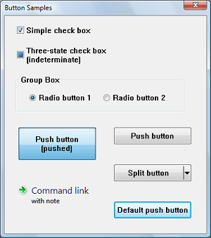
The screen shot shows how buttons might appear in Windows Vista. The appearance will vary on different versions of the operating system, and according to the theme set by the user.
Note the following points about the illustration:
• The three-state check box is shown in the indeterminate state. When checked or unchecked, it looks like a normal check box.
• The large push button has been set to the pushed state programmatically (by sending the BM_SETSTATE message), so that it retains its appearance even when it is not being clicked.
• In the visual style shown, the background of the default push button (or another push button that has the input focus) cycles between blue and gray.
Button styles are set on creation and determine the button type:
| Constant | Description | |||
|---|---|---|---|---|
| BS_3STATE | Creates a button that is the same as a check box, except that the box can be grayed as well as checked or cleared. Use the grayed state to show that the state of the check box is not determined. | |||
| BS_AUTO3STATE | Creates a button that is the same as a three-state check box, except that the box changes its state when the user selects it. The state cycles through checked, indeterminate, and cleared. | |||
| BS_AUTOCHECKBOX | Creates a button that is the same as a check box, except that the check state automatically toggles between checked and cleared each time the user selects the check box. | |||
| BS_AUTORADIOBUTTON | Creates a button that is the same as a radio button, except that when the user selects it, the system automatically sets the button’s check state to checked and automatically sets the check state for all other buttons in the same group to cleared. | |||
| BS_BITMAP | Specifies that the button displays a bitmap. | |||
| BS_BOTTOM | Places text at the bottom of the button rectangle. | |||
| BS_CENTER | Centers text horizontally in the button rectangle. | |||
| BS_CHECKBOX | Creates a small, empty check box with text. By default, the text is displayed to the right of the check box. To display the text to the left of the check box, combine this flag with the BS_LEFTTEXT style (or with the equivalent BS_RIGHTBUTTON style). | |||
| BS_DEFPUSHBUTTON | Creates a push button that behaves like a BS_PUSHBUTTON style button, but has a distinct appearance. If the button is in a dialog box, the user can select the button by pressing the ENTER key, even when the button does not have the input focus. This style is useful for enabling the user to quickly select the most likely (default) option. | |||
| BS_FLAT | Specifies that the button is two-dimensional; it does not use the default shading to create a 3-D image. Note that the default Windows 10 theme is flat. | |||
| BS_GROUPBOX | Creates a rectangle in which other controls can be grouped. Any text associated with this style is displayed in the rectangle’s upper left corner. | |||
| BS_ICON | Specifies that the button displays an icon. | |||
| BS_LEFT | Left-justifies the text in the button rectangle. However, if the button is a check box or radio button that does not have the BS_RIGHTBUTTON style, the text is left justified on the right side of the check box or radio button. | |||
| BS_LEFTTEXT | Places text on the left side of the radio button or check box when combined with a radio button or check box style. Same as the BS_RIGHTBUTTON style. | |||
| BS_MULTILINE | Wraps the button text to multiple lines if the text string is too long to fit on a single line in the button rectangle. | |||
| BS_NOTIFY | Enables a button to send BN_KILLFOCUS and BN_SETFOCUS notification codes to its parent window. Note that buttons send the BN_CLICKED notification code regardless of whether it has this style. To get BN_DBLCLK notification codes, the button must have the BS_RADIOBUTTON or BS_OWNERDRAW style. | |||
| BS_PUSHBUTTON | Creates a push button that posts a WM_COMMAND message to the owner window when the user selects the button. | |||
| BS_PUSHLIKE | Makes a button (such as a check box, three-state check box, or radio button) look and act like a push button. The button looks raised when it isn’t pushed or checked, and sunken when it is pushed or checked. | |||
| BS_RADIOBUTTON | Creates a small circle with text. By default, the text is displayed to the right of the circle. To display the text to the left of the circle, combine this flag with the BS_LEFTTEXT style (or with the equivalent BS_RIGHTBUTTON style). Use radio buttons for groups of related, but mutually exclusive choices. | |||
| BS_RIGHT | Right-justifies text in the button rectangle. However, if the button is a check box or radio button that does not have the BS_RIGHTBUTTON style, the text is right justified on the right side of the check box or radio button. | |||
| BS_RIGHTBUTTON | Positions a radio button’s circle or a check box’s square on the right side of the button rectangle. Same as the BS_LEFTTEXT style. | |||
| BS_TEXT | Specifies that the button displays text. | |||
| BS_TOP | Places text at the top of the button rectangle. | |||
| BS_VCENTER | Places text in the middle (vertically) of the button rectangle. |
A check box consists of a square box and an application-defined label, icon, or bitmap that indicates a choice the user can make by selecting the button. Applications typically display check boxes to enable the user to choose one or more options that are not mutually exclusive.
A check box can be one of four styles: standard, automatic, three-state, and automatic three-state, as defined by the constants BS_CHECKBOX, BS_AUTOCHECKBOX, BS_3STATE, and BS_AUTO3STATE, respectively. Each style can assume two check states: checked (a check mark inside the box) or cleared (no check mark). In addition, a three-state check box can assume an indeterminate state (a shaded box inside the check box), which might signify that the user has not made a choice. Repeatedly clicking a standard or automatic check box toggles it from checked to cleared and back again. Repeatedly clicking a three-state check box toggles it from checked to cleared to indeterminate and then repeats the cycle.
When the user clicks a check box (of any style), the check box receives the keyboard focus. The system sends the dialog box's action procedure a message containing the BN_CLICKED notification code. The parent window does not have to handle this message if it comes from an automatic check box or automatic three-state check box because the system automatically sets the check state for those styles, but the parent window must handle the message if it comes from a non-automatic check box or three-state check box because the parent window is responsible for setting the check state for those styles. Regardless of the check box style, the system automatically repaints the check box once its state is changed.
The application can ascertain the state of a check box by using the CheckboxGetState function.
A group box is a rectangle that surrounds a set of controls, such as check boxes or radio buttons, with an application-defined text label in its upper left corner. The sole purpose of a group box is to organize controls related by a common purpose (usually indicated by the label). The group box has only one style, defined by the constant BS_GROUPBOX. Because a group box cannot be selected, it has no check state, focus state, or push state.
A push button is a rectangle containing an application-defined text label, an icon, or a bitmap that indicates what the button does when the user selects it.
A push button can be one of two styles, standard or default, as defined by the constants BS_PUSHBUTTON and BS_DEFPUSHBUTTON. A standard push button is typically used to start an operation. It receives the keyboard focus when the user clicks it. A default push button is typically used to indicate the most common or default choice, such as closing the dialog box. It is a button that the user can select by simply pressing the Enter key when no other push button in the dialog box has the input focus.
When the user clicks a push button, it receives the keyboard focus. The system sends the button’s parent window a WM_COMMAND message that contains the BN_CLICKED notification code. This is then received as a call to the “action” procedure.
Buttons may be single or split. A split button is divided into two parts. The main part functions like a regular or default push button. The second part has an arrow pointing downward. Typically, a menu is displayed when the arrow is clicked.
When the user clicks on the main part of the split button, it sends a BN_CLICKED notification just like a normal push button. But when the user clicks on the down arrow, it sends a BCN_DROPDOWN notification. It is the application's responsibility to display a menu in response to BCN_DROPDOWN.
A radio button (also called option button) consists of a round button and an application-defined label, icon, or bitmap that indicates a choice the user can make by selecting the button. An application typically uses radio buttons in a group box to enable the user to choose one of a set of related but mutually exclusive options.
A radio button can be one of two styles: standard or automatic, as defined by the style constants BS_RADIOBUTTON and BS_AUTORADIOBUTTON. Each style can assume two check states: checked (a dot in the button) or cleared (no dot in the button).
When the user selects either state, the radio button receives the keyboard focus. The system sends the button’s dialog action procedure message containing the BN_CLICKED notification code. The parent window need not handle this message if it comes from an automatic radio button because the system automatically sets the check state for that style. But the parent window should handle the message if it comes from a non-automatic radio button because the parent window is responsible for setting the check state for that style. Regardless of the radio button style, the system automatically repaints the button as its state changes.
Radio buttons are arranged in groups and only one button in the group can be checked at any time. If the WS_GROUP flag is set for any radio button, that button is the first button in a group, and all buttons that follow it immediately in the tab order (but do not themselves have the WS_GROUP flag) are part of its group. If no radio buttons have the WS_GROUP flag, all the radio buttons in the dialog box are treated as a single group.
For multiple groups with automatic radio buttons, the ordering of controls is critical. The subsequent group box controls must be between the groups of radio buttons. Failure to properly group will result in unexpected behavior. Programmers are cautioned to always check the behavior of dialog boxes containing multiple radio button groups.
The application can ascertain whether a radio button is checked by using the CheckboxGetState function.
The following button notifications can be sent to the action procedure (placed in the second parameter, control action):
| Define | Code | Description | ||||
| BN_CLICKED | 0 | Sent when the user clicks a button. | ||||
| BN_HILITE | 2 | Sent when the user selects a button. | ||||
| BN_UNHILITE | 3 | Sent when the highlight should be removed from a button. This is used principally in owner draw controls. | ||||
| BN_DISABLE | 4 | Sent when a button is disabled. This is used principally in owner draw controls. | ||||
| BN_DOUBLECLICKED | 5 | Sent when the user double-clicks a button. This notification code is sent automatically for BS_USERBUTTON, BS_RADIOBUTTON, and BS_OWNERDRAW buttons. Other button types send BN_DOUBLECLICKED only if they have the BS_NOTIFY style. | ||||
| BN_PUSHED | BN_HILITE | Sent when the push state of a button is set to pushed. This is used principally in owner draw controls. | ||||
| BN_UNPUSHED | BN_UNHILITE | Sent when the push state of a button is set to unpushed. This is used principally in owner draw controls. | ||||
| BN_DBLCLK | BN_DOUBLECLICKED | Same as BN_DOUBLECLICKED. | ||||
| BN_SETFOCUS | 6 | Sent when a button receives the keyboard focus. The button must have the BS_NOTIFY style to send this notification code. | ||||
| BN_KILLFOCUS | 7 | Sent when a button loses the keyboard focus. The button must have the BS_NOTIFY style to send this notification code. |
| Table of Contents | < < Previous | Next >> |
© 2012-2025 Novaworks, LLC. All rights reserved worldwide. Unauthorized use, duplication or transmission is prohibited by law. Portions of the software are protected by US Patents 10,095,672, 10,706,221 and 11,210,456. Novaworks, GoFiler™ and Legato™ are registered trademarks of Novaworks, LLC. EDGAR® is a federally registered trademark of the U.S. Securities and Exchange Commission. Novaworks is not affiliated with or approved by the U.S. Securities and Exchange Commission. All other trademarks are the property of their respective owners. Use of the features specified in this language are subject to terms, conditions and limitations of the Software License Agreement.