  |
GoFiler Legato Script Reference
Legato v 1.6f Application v 6.4a
|
| Table of Contents | < < Previous | Next >> |
Chapter Nine — Dialog Functions (continued)
A list box control presents a simple list from which the user can generally select one or more items. List boxes are useful for iterating for selection, editing and other purposes.
While in general, list box items can be represented by text strings, bitmaps, or both, Legato presently only supports strings. When a list box is not large enough to accommodate all the items at once, a scrollbar is displayed. A user can then scroll through the list box items and select, apply or remove selected items as necessary.
When a user acts on a list box, certain messages are sent via the dialog’s ‘action’ procedure.
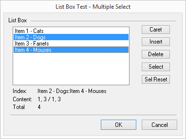
Image from List Box Test Example
In the above example, a multiple selection list box is shown with two selections. The ‘Index’ and ‘Content; field demonstrate the retrieval from array items as selected content and selection indices.
9.16.2 List Box Types and Styles
The appearance and operation of a list box is controlled by list box styles and window styles. These styles indicate whether the list is sorted, arranged in multiple columns, drawn by the application, and so on. The dimensions and styles of a list box are typically defined in the control specification within a dialog resource.
There are two types of list boxes: single-selection (the default) and multiple-selection. In a single-selection list box, the user can select only one item at a time. In a multiple-selection list box, the user can select more than one item at a time. To create a multiple-selection list box, specify the LBS_MULTIPLESEL or the LBS_EXTENDEDSEL style in the control style data within the dialog resource. Programmers must use caution in terms of which selection routines are used since there are single select functions and multiple select functions.
The following table specifies the list box styles that can be used within a resource control’s style field. These can be combined with certain Windows styles. (Note that only those Windows styles supported by Legato are shown.)
| Constant | Description | ||
| LBS_COMBOBOX | Notifies a list box that it is part of a combo box. This allows coordination between the two controls so that they present a unified UI. The combo box itself must set this style. If the style is set by anything but the combo box, the list box will regard itself incorrectly as a child of a combo box and a failure will result. | ||
| LBS_DISABLENOSCROLL | Shows a disabled horizontal or vertical scrollbar when the list box does not contain enough items to scroll. If you do not specify this style, the scrollbar is hidden when the list box does not contain enough items. This style must be used with the WS_VSCROLL or WS_HSCROLL style. | ||
| LBS_EXTENDEDSEL | Allows multiple items to be selected by using the SHIFT key and the mouse or special key combinations. | ||
| LBS_MULTIPLESEL | Turns string selection on or off each time the user clicks or double-clicks a string in the list box. The user can select any number of strings. | ||
| LBS_NOINTEGRALHEIGHT | Specifies that the size of the list box is exactly the size specified by the application when it created the list box. Normally, the system sizes a list box so that the list box does not display partial items. For list boxes with the LBS_OWNERDRAWVARIABLE style, the LBS_NOINTEGRALHEIGHT style is always enforced. | ||
| LBS_NOREDRAW | Specifies that the list box's appearance is not updated when changes are made. To change the redraw state of the control, use the WM_SETREDRAW message. | ||
| LBS_NOSEL | Specifies that the list box contains items that can be viewed but not selected. | ||
| LBS_NOTIFY | Causes the list box to send a notification code to the parent window whenever the user clicks a list box item (LBN_SELCHANGE), double-clicks an item (LBN_DBLCLK), or cancels the selection (LBN_SELCANCEL). | ||
| LBS_SORT | Sorts strings in the list box alphabetically. | ||
| LBS_STANDARD | Sorts strings in the list box alphabetically. The parent window receives a notification code whenever the user clicks a list box item, double-clicks an item, or cancels the selection. The list box has a vertical scrollbar, and it has borders on all sides. This style combines the LBS_NOTIFY, LBS_SORT, WS_VSCROLL, and WS_BORDER styles. | ||
| LBS_USETABSTOPS | Enables a list box to recognize and expand tab characters when drawing its strings. Use the ListBoxSetTabPositions function to set the tab stops in dialog units. |
All list box notification are processed through the “action” procedure. The Control Action value (2nd parameter) will contain the notification or action code. Note that certain of these messages are only sent to the script if LBS_NOTIFY is set within the control’s style.
| Notification code | Value | Description | ||||
|---|---|---|---|---|---|---|
| LBN_DBLCLK | 2 | The user double-clicks an item in the list box. | ||||
| LBN_ERRSPACE | -2 | The list box cannot allocate enough memory to fulfill a request. | ||||
| LBN_KILLFOCUS | 5 | The list box loses the keyboard focus. | ||||
| LBN_SELCANCEL | 3 | The user cancels the selection of an item in the list box. | ||||
| LBN_SELCHANGE | 1 | The selection in a list box is about to change. | ||||
| LBN_SETFOCUS | 4 | The list box receives the keyboard focus. |
Adding data to a list box:
ListBoxAddArray — Adds an array of items to the list to the end or in sorted position.
ListBoxAddItem — Adds string or integer item to list box end or in sorted position.
ListBoxInsertItem — Inserts an item in a list box at a specified position as a string or integer.
ListBoxLoadList — Loads a list of items to a list box.
ListBoxLoadFolder — Loads the list box with a file/folder list from a specified folder.
Content Management:
ListBoxDeleteItem — Deletes an item from list box specified by Index.
ListBoxFindItem — Finds an item within list box. Exact non-case-sensitive exact match.
ListBoxReplaceItem — Replaces the specified item within a list box.
ListBoxReset — Resets list box content.
ListBoxSetTabPositions — Sets the tab positions for list box from an integer array or from a series of integers.
Control:
ControlDisable — Disables specified control.
ControlEnable — Enables specified control.
ControlHide — Hides a specified control.
ControlShow — Shows a specified control (if hidden).
Retrieving Data:
ListBoxGetArray — Gets all list box items into an array.
ListBoxGetItemCount — Gets the count of list box items.
ListBoxGetItemText — Gets the text for a list box item.
Single Select
ListBoxGetSelectIndex — Gets the select index in a single-select mode list box.
ListBoxSetSelectIndex — Selects an item at zero-based position for single-select list box.
Multiple Select:
ListBoxGetSelectArray — Gets a string array of the content of selected items.
ListBoxGetSelectCount — Gets the list box select count.
ListBoxGetSelectList — Gets an array of integers of selected item positions.
ListBoxSetCaret — Sets the display caret position within list box.
ListBoxSelectItem — Selects an item in at zero-based position for a multiple select dialog.
ListBoxTestItemSelect — Tests for a specific item being selected with a multiple select list box.
Page revised 2026-01-05
| Table of Contents | < < Previous | Next >> |
© 2012-2025 Novaworks, LLC. All rights reserved worldwide. Unauthorized use, duplication or transmission is prohibited by law. Portions of the software are protected by US Patents 10,095,672, 10,706,221 and 11,210,456. Novaworks, GoFiler™ and Legato™ are registered trademarks of Novaworks, LLC. EDGAR® is a federally registered trademark of the U.S. Securities and Exchange Commission. Novaworks is not affiliated with or approved by the U.S. Securities and Exchange Commission. All other trademarks are the property of their respective owners. Use of the features specified in this language are subject to terms, conditions and limitations of the Software License Agreement.